Performance Tracking And Dashboard
Comparing actuals to your forecast with Dashboard Trends
The Trends page of the Dashboard section gives you a detailed picture of your company's health. The Trends view uses twenty-nine different Dashboard metrics, including revenue, expenses, cash flow, net profit, gross margin, AR, AP, and so on.
Note: If you use classes in your QuickBooks account, then you'll have access to an additional six metrics based on your classes.
Using this view, you can dig into the details of how your actuals compare to your forecast (or your past performance).

Note: To learn more about each of the available Dashboard metrics, read Metrics available on the LivePlan Dashboard.
Navigating the Trends view
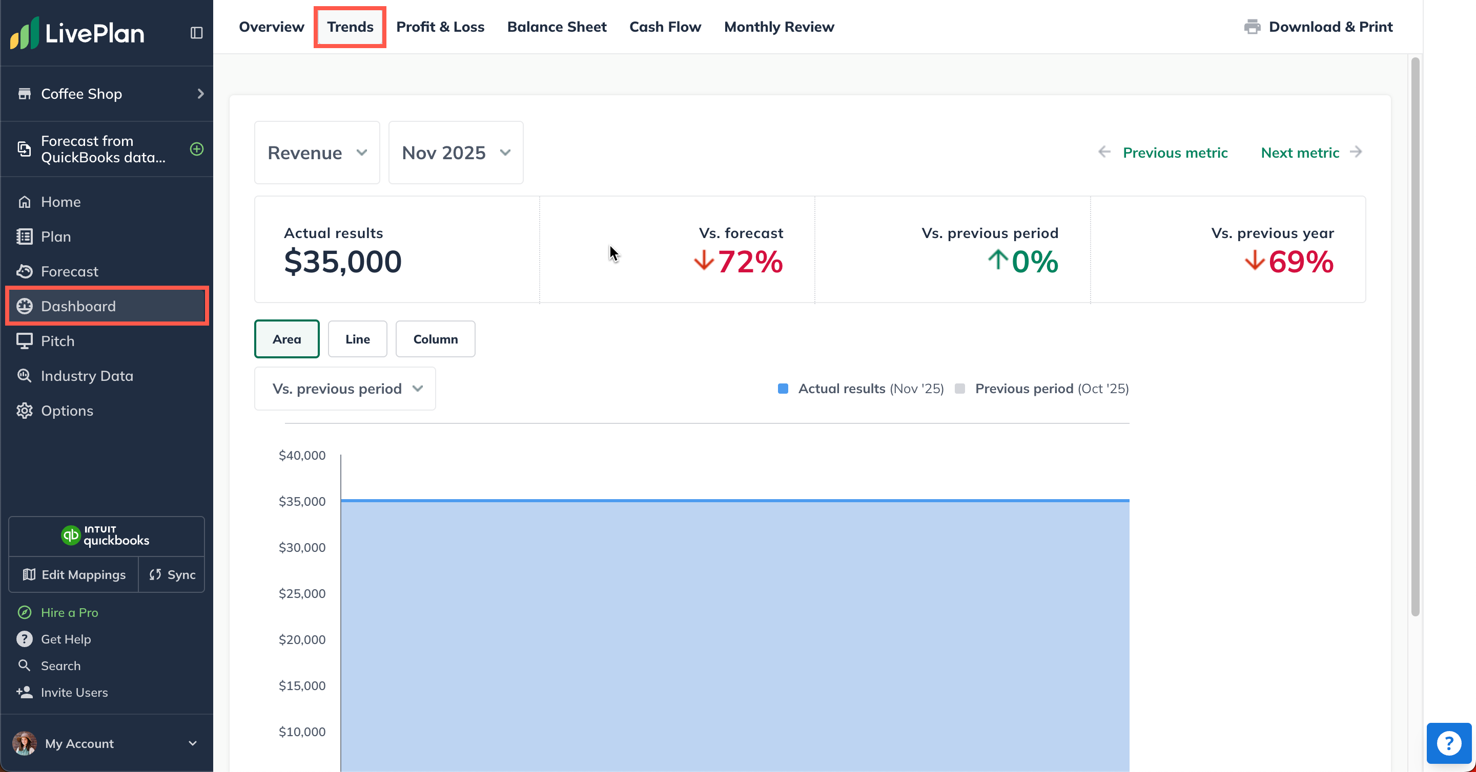
From anywhere in the Dashboard section, click Trends:

You can also get to the Trends view from the Overview page. Simply click on any of the metric boxes displayed in the Dashboard Overview to jump to the Trend view:

Customizing your Trends view
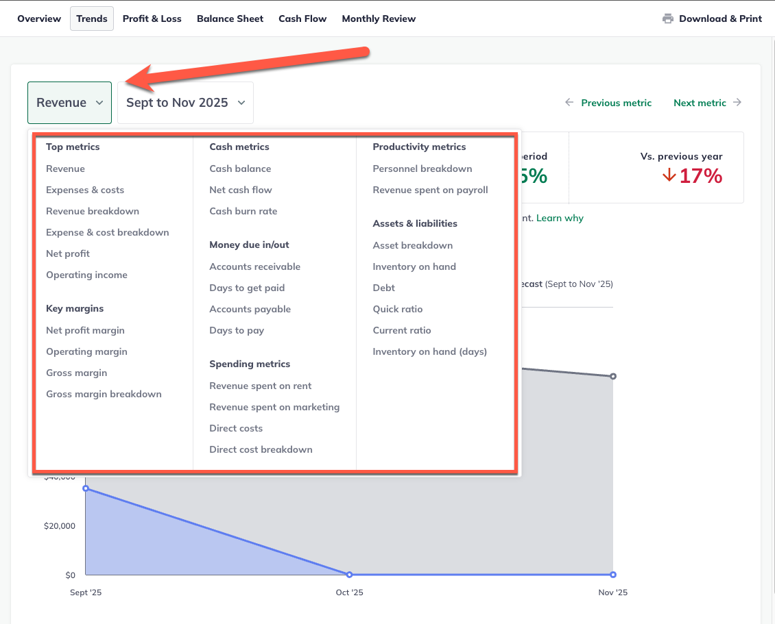
To get started with your Trends, first choose the metric you want to view.
Click on the metric dropdown and make a selection from the listed metrics

Note: There are more metrics available on the Trends view than there are on the Overview. To learn more about all of the metrics, read Metrics available on the LivePlan Dashboard.
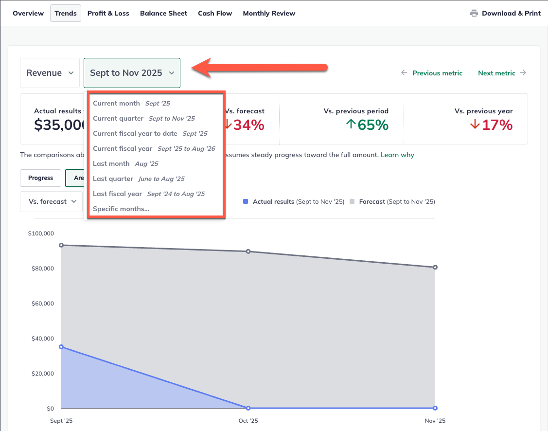
Once you've selected a metric, then it's time to choose a date range. Use the date selector to choose a period to view:

After you've chosen a metric and a period to view, you'll see a new display, called the value stripe, at the top of the Trends screen. You'll learn more about this view below.
Reading the value stripe
The value stripe offers several snapshots:
Your actual results for the period you've selected
Those actuals compared to your forecast
Those actuals compared to the previous period
Those actuals compared to the same period the previous year

If you haven't entered actuals or forecast data for a the period you've selected to view, then LivePlan can't calculate a comparison percentage. Instead, you'll see "--" in the value stripe where the comparison should be:

When you're looking at the value stripe, it’s sometimes useful to see your actual target values. Hovering over the value stripe will show you these target values:

Viewing the Trend charts
The charts at the bottom of the Trends view provide a detailed view of the metric and period you've chosen. You can switch between several chart types if you prefer. (For more details on charts, read Chart types in the Dashboard.)

You can mouse over any point in your Trends charts, and a pop-up will appear, showing the actual and comparison numbers for specific months:

If you're using an area, thermometer, or column chart in your display, then you'll need to choose a period for data comparison, as shown below. To choose a comparison period, simply click the selector and choose from the pull-down menu:

Donut, line, bar, and progress charts, as well as tables, on the other hand, don't require any comparison selection.
Why does the Dashboard trend view show the elapsed portion only?
If you choose a metric that accumulates over the course of the month—like revenue, expenses, or direct costs—and then select a period from your actuals that includes the current month still in progress (i.e., current month, current quarter, current year), the stripe at the top of the trend view shows you comparisons for just the elapsed portion of the month or period.
The logic here is that when viewing a month or quarter that's still in progress, you want to compare that to a similar portion of the month or quarter from your forecast or past performance, not the whole period. For example, if you are only five days into the current month, you don't want to compare your numbers from those five days to an entire month from your forecast or past period data because that will give you a skewed view of how things are going.
We've made a simple linear assumption to calculate your progress in this situation. If you're five days into a 30-day-long current month, LivePlan compares your actuals to 5/30ths of the previous month (i.e., an average value, not a comparison to the first five days of the month).
Using the following image as an illustration, you can see that several days into the month, you are 60% behind your planned revenue for the quarter (which is bad news); you are also 33% behind for revenue compared to the same point in the previous quarter (which is also bad news). This gives you a much more accurate view of how things are going for the current period.

